

While there is still plenty of bold color options for S/S 24, we’re loving the return of those soft, delicious pastels. Lemon drop yellows, tarragon greens, chambray blues, lovely lilacs and fondant pinks all have our undivided attention. How much do we love them? We’ll give you thirty reasons why you should too.
GLORIOUS GREENS
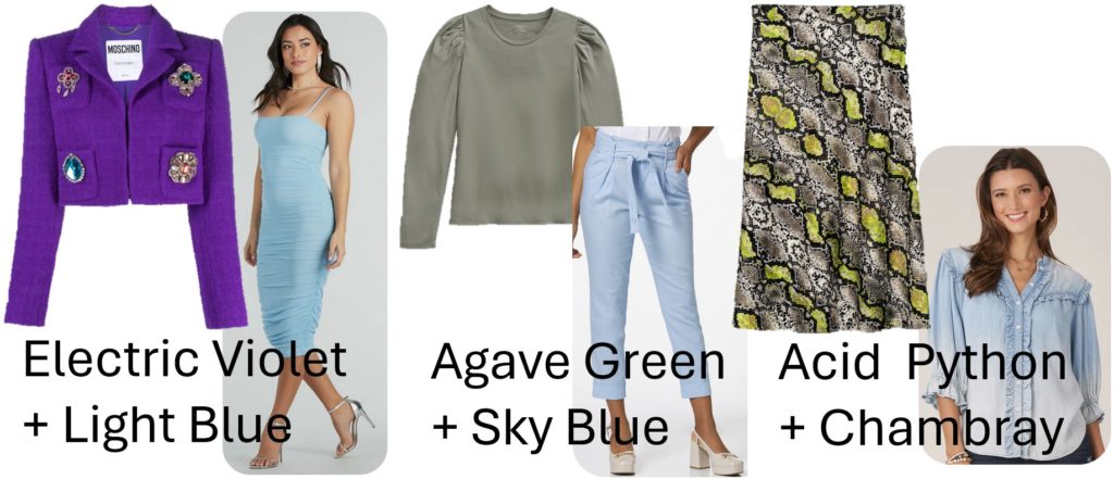
From mint to sage, pistachio to tarragon, this season we’re getting our greens big time. Light greens go great with other complementary colors of the season, like mauve, toasty browns and light blues.
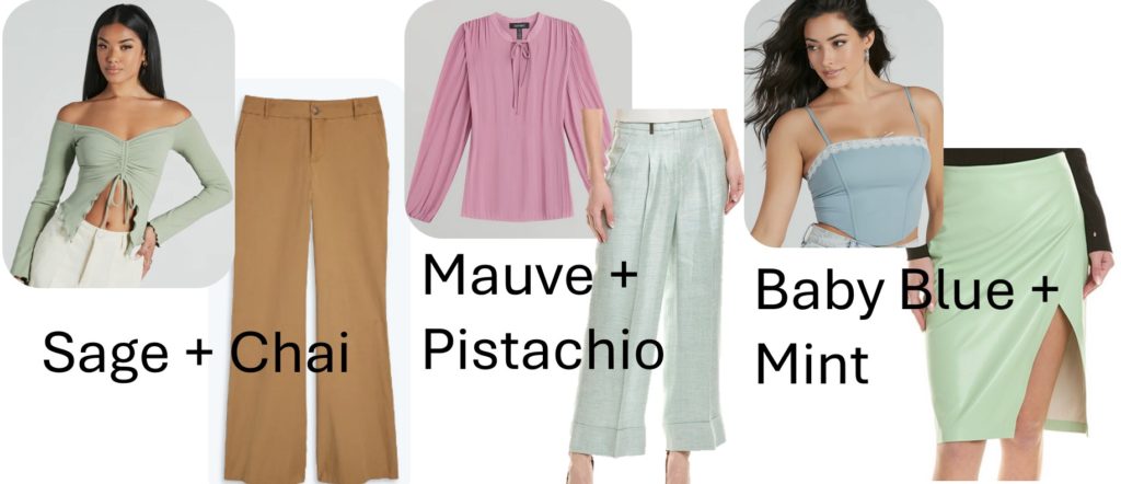
FROM LEFT TO RIGHT:
-
Windsor, Day To Day Off-The-Shoulder Crop Top $29.90
-
Summersalt, The Easy High-Waisted Flare Pant $95
-
Ellen Tracy, Long Sleeve Semi-Pleated Shirt $89
-
Peserico, Linen-Blend Pant $299.99 (on Sale NOW from $740)
-
Windsor, Lace To Remember Sleeveless Crop Corset Top $36.90
-
alice + olivia, Siobhan Midi Skirt $119.99 (on Sale NOW from $285)
Lighter greens are also great for serving as a neutral against the season’s bold color choices
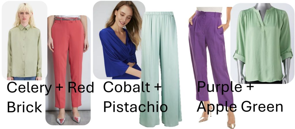
FROM LEFT TO RIGHT:
-
The Kooples, Light Green Satin Silk Shirt $345
-
Elie Tahari, Slim Slit Pant in Wonder Wheel $295
-
Diane von Furstenberg, Fran Top $139 (on Sale NOW from $278)
-
Antonelli, High-Waisted Palazzo Pants $356
-
Sandro, Pleated Pant $149.99 (on Sale NOW from 340)
-
Vera Wang, Shirred Roll Tab Popover Top $44.99
And finally, pastel greens are an excellent choice for a chic monochromatic look
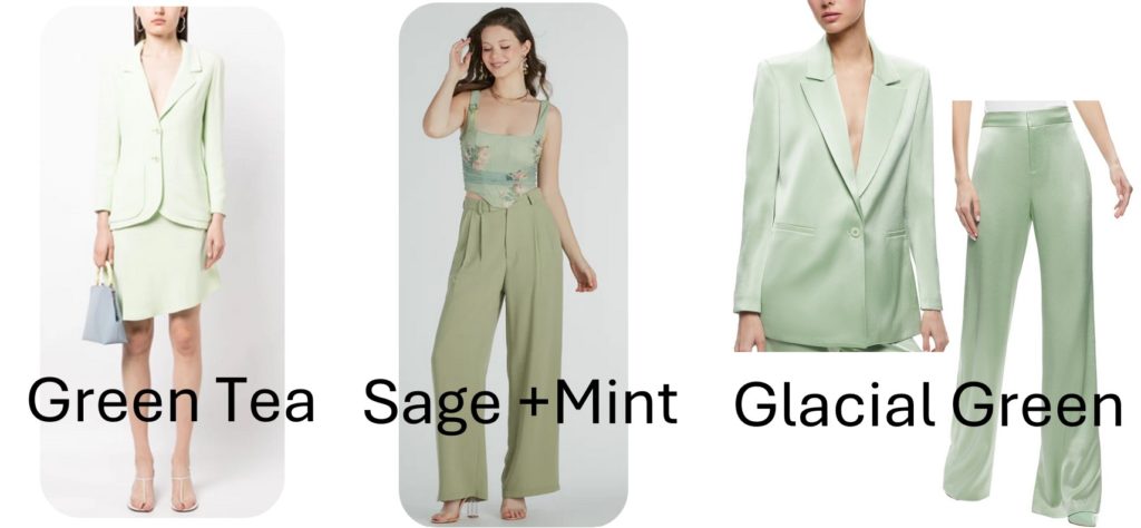
FROM RIGHT TO LEFT:
-
Chanel, Pre-Owned 1994 Single-Breasted Skirt Suit $2,171
-
Windsor, Blooming Beauty Floral Ruched Mesh Corset Top $36.90 and Like Clockwork High-Rise Wide Leg Trouser Pant $44.90
-
alice + olivia, Denny Boyfriend Blazer $219.99 and High-Waist Bootcut Slim Pant $121.99
PERFECTIONS IN PINK
Pink in all its magnificent shades has been the color de jour for several seasons, thanks to a *certain* movie. But as we head into the S/S we are seeing less head-to-toe, eye-watering hot pinks and fuchsias in favor of softer, lighter shades. But don’t retire your brights just yet, there’s still plenty of love for Barbie pink and magentas when you need that burst of color pop.
That said, these lighter pinks play oh-so-well with their seasonal complementary colors such as soft grays, minty greens and warm neutrals.
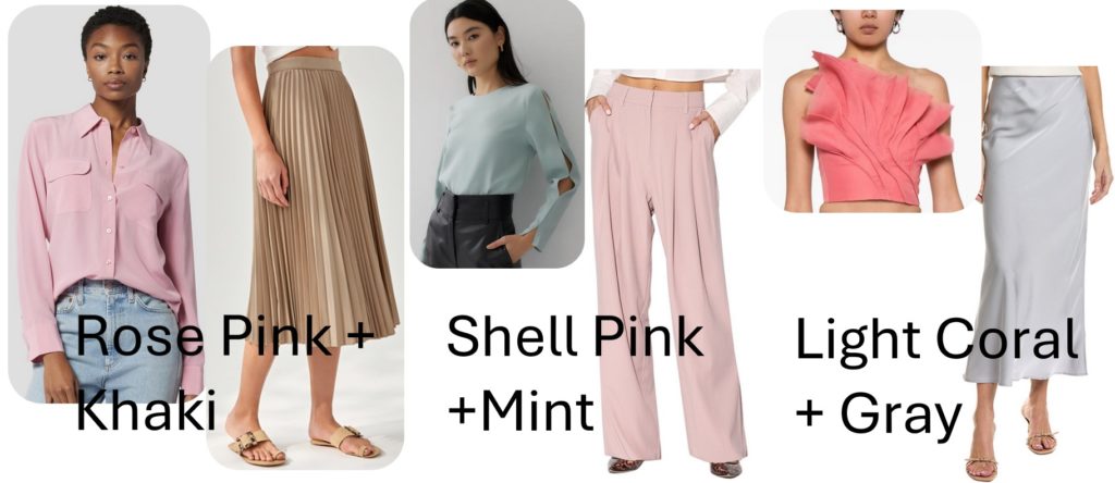
FROM LEFT TO RIGHT:
-
Equipment, Slim Signature Silk Skirt $250
-
Love, Bonito, Elinie Pleated Midi Skirt $55
-
Love, Bonito, Nolana Round Neck Blouse $39
-
Walter Baker, Tammy Pant $69.99 (on Sale NOW from $188)
-
Aje, Flame Crop Top $245
-
Rosewater Remi, Maxi Slip Skirt $99.99 (on Sale NOW from $210)
They also hold their own as a sweet contrast against jewel tones, bold brights, and of course the classic combination of fem-forward edgy – pink and black.
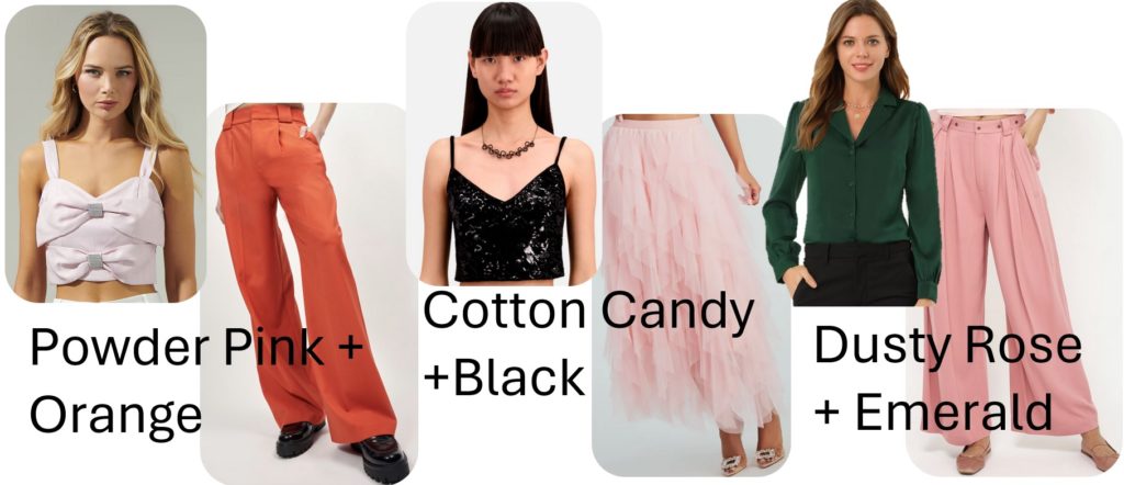
FROM LEFT TO RIGHT:
-
Sugarlips, Lina Bow Crop Top $70
-
Equipment, Owen Trouser $263 (on Sale NOW from $375)
-
The Kooples, Black Velvet Cropped Top w/Sequins $136.90 (on Sale NOW from $195)
-
Windsor, A Little Drama Ruffled Tulle Midi Skirt $49.90
-
Allegra K, Satin Button Down Shirt $35.99
-
Joie, Kinsley Pant $109 (on Sale NOW from $248)
Finally, for that monochromatic look, feel free to go full matchy-matchy, or play around with slight shade adjustments.
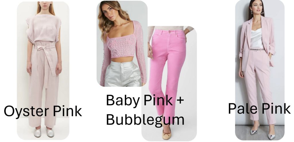
FROM LEFT TO RIGHT:
-
Issey Miyake, Aerate Pleats Shirt $820 and Shaped Membrane Pants $1,085
-
Windsor, Pearly Babe Rhinestone Long Sleeve Crop Top $39.90
-
J. McLaughlin, Lenni Velvet Jeans $188
-
Elie Tahari, Ruched Sleeve Blazer $375 and Slim Slit Pant $295
LOVELY LILACS & LAVENDERS
Moving over to the cooler side, this season is seeing no shortage of icy shades of purple. From wonderful wisteria to lavenders, light plums and the main character of them all, lovely lilac.
These blooming beauties are seamlessly simpatico with their complementary cousins, including this season’s peaches, light blues, and that favorite pairing – purple and gray.
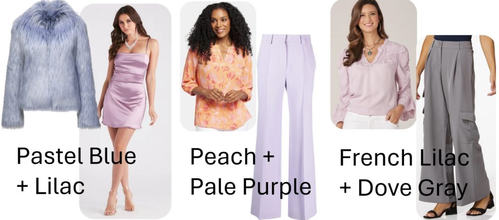
FROM LEFT TO RIGHT:
-
Unreal Fur, Faux Fur Delish Jacket $459
-
Windsor, Day Glow Satin A-Line Short Dress $34.90
-
NYDJ, Pintuck Blouse $89
-
Victoria Beckham, Straight Leg Trousers $373 (on Sale NOW from $621)
-
Democracy Clothing, Pintuck Tencel Woven Top $84
-
Cato, Wide Leg Cargo Pants $27.99
Being such a cool customer, these icy purples are great for lowering the temperature on many of the season’s big and bolds, like fiery reds, bright greens and vivid yellows.
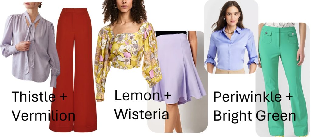
FROM LEFT TO RIGHT:
-
Bella Dahl, Tie Top $49.99 (on Sale NOW from $158)
-
Adam Lippes, Deeda Pant In Silk Wool $1,990
-
Sando, Silk Top $149.99
-
Issac Mizrahi, Knit Gore Skirt $17.09 (on Sale NOW from $53)
-
A New Day, Slim Fit Satin Button Down Shirt $25
-
Karl Lagerfeld, Nylon Compression Pant $99
And of course, they look just as wonderful tone-on-tone.
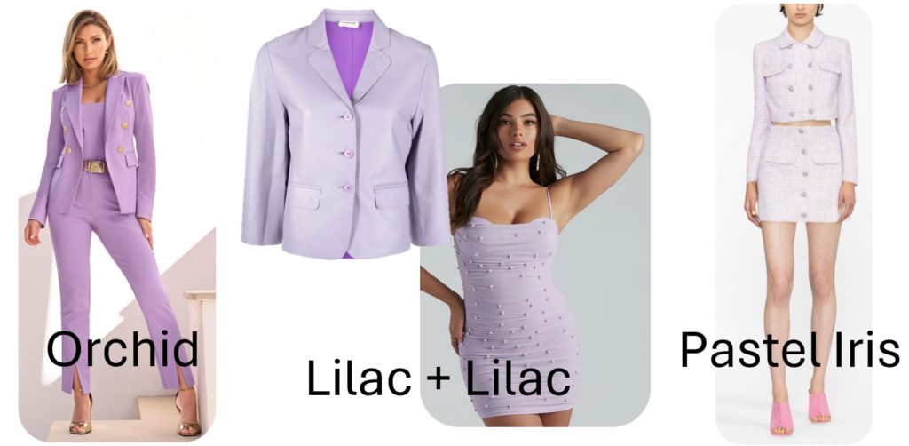
FROM LEFT TO RIGHT:
-
Boston Proper, Modern Double Breasted Blazer $150 and Slim Straight Leg $100
-
P.A.R.O.S.H., Cropped Lambskin Jacket $610
-
Windsor, Kristen Faux Pearl Mini Party Dress $52.90
-
Self-Portrait, Boucle Cropped Jacket $464 and High-Waisted Mini Skirt $380
BEAUTIFUL BLUES
Finally we come to our beautiful blues. With so many pale shades coming into focus this year, you’d be hard pressed to find looks they wouldn’t go with. That said, there are of course, combinations that understand the assignment much better than others.
For complementary seasonal colors, this year we’re embracing pale yellows, modest greens and (drum roll) Pantone’s 2024 “it” color – Peach Fuzz.
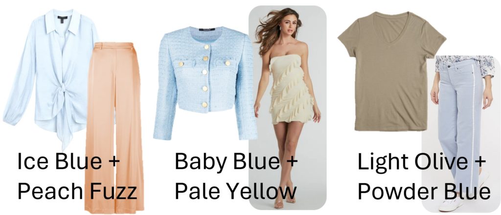
FROM LEFT TO RIGHT:
-
Ellen Tracy, Tie Front Blouse $62.30 (on Sale NOW from $89)
-
Forte Forte, Satin Silk Palazzo Pants $504
-
Tagliatore, No-Lapels Cropped Tweed Jacket $337
-
Windsor, Sip Of Sultry Strapless Ruffle Mini Dress $42.90
-
Mott & Bow, Fitted V-Neck Marcy Tee $40
-
NYDJ, Teresa Wide Leg Ankle Pant $119
Pale blues are also great for brightening up this season’s moodier color as well as giving cool contrast to those bold brights.
FROM LEFT TO RIGHT:
-
Moschino, Crystal-Embellished Wool-Blend Cropped Jacket $1,178
-
Windsor, Sheer Desire Square Neck Bodycon Mesh Midi Dress $28.90
-
Summersalt, The Luxe Pima Long-Sleeve Statement Tee $65
-
Cato, Sky Blue Linen Pants $25.99
-
Universal Standard, Cee Cee Midi Bias Skirt $25 (on Sale NOW from $128)
-
Democracy Clothing, Ruffle Edge Stand Collar Woven Top $84
And as with all these fabulous pastels, blue also works fantastically head to toe.
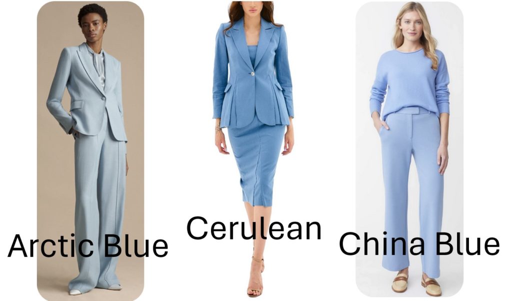
FROM LEFT TO RIGHT:
-
Adam Lippes, Single Breasted Blazer in Stretch Canvas $1,590 and Full Leg Trouser $1,190
-
BGL, Single Button Jacket $299.99 and Pleated Strapless Dress $249.99
-
J. McLaughlin, Mecox Sweater $148 and Brock Pants $198
Be the first to comment